Dinamo Type Foundry
Interview by Amris Kaur
Dinamo is a small foundry that is creating some of the most unique and interesting typefaces in Europe. Beautiful and complex Galapagos delights the eye, chunky bold Pareto makes us drool with its possibility to hold ink and Favorit Lining lends its loveliness to a page like no other.
Founded by Swiss duo Johannes Breyer and Fabian Harb, these two have created custom fonts for clients as diverse as Warp Records, Harvard University, and Kunsthalle Zurich. We spoke to them to get an insight into their world of shape and style, and learn more about their love of letters.

How does rising to prominence in the field of font creation differ from other avenues of design, if at all?
We only got started, so it does not make much sense to answer this too seriously. But gaining larger attention definitely allows us to approach and be approached by a wider range of people and explore new fields. But then again, we have the luck to work with great people and see this as a key part of our practice … changing anything only makes sense if nothing gets compromised.

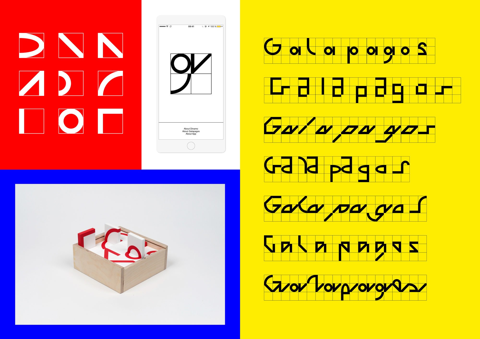
We’re loving your Galapagos font and the idea of fonts that belong to a bigger picture in their role in design, such as how Galapagos is as typeface, boardgame, app. What else can Galapagos do?
Galapagos really was an experiment: it’s not only the first time we collaborated with somebody external on a typeface release, but also working on an app or on objects was new to us and we are extremely grateful to Felix Salut, Alessandro Saccoia, Gustavo Ferreira and Chi-Long Trieu for going through this with us. So next, we now travel to the actual islands and see whether all we did makes sense!

“Knowing the limitations of multilingual projects or economies where proper font licensing is utopic, in its core Google Fonts seems like a great initiative that just went a bit off track.”
There seems to be a lot of controversy surrounding Google Fonts. We’ve heard different views from both sides of the spectrum. Do you dare to comment on the Big Daddy of the internet and their role in fonts?
Knowing the limitations of multilingual projects or economies where proper font licensing is utopic, in its core Google Fonts seems like an great initiative that just went a bit off track. Offering well-produced fonts with extensive character sets for free can be a cool move, but suddenly it seems like their releases shifted a little from acting cool to looking cool. This is why it’s really against our understanding why a small independent type foundry would be willing to sell their design and soul to make a hyper corporate company look young, radical and individual – while it doesn’t act anything like that. We’d imagine that it is in Google’s interest as well to be able to offer something original, so a little more research would have been beneficial.


How do two people work on a font – do you each have styles, or do you collaborate?
It varies a lot. The commission to design the catalogue of the 2014 Graphic Design Biennial of Brno (CZ) and a late arrival of actual contents allowed us to draw all 824 characters of Favorit together with 4 hands and 4 eyes in front of 1 computer and taught us a great deal about working together – in the same or different rooms and timezones. Since then, we developed various workflows and found responsible but refreshing ways to do stuff together, individually or combined.
Do you have a particular letter that you find more interesting than others?
Obviously a lowercase S offers more challenges than an X, but in general, more complex characters can add more flavour and if we’d really had to choose our favorite letter it would probably be A – coming with great dynamics and as the first letter in the alphabet, it’s certainly a winner.


Grow is our favourite of your fonts because of the concept behind it – what inspired that?
Grow derived from an old Letraset specimen we found in a library during our time in Amsterdam: fascinated by its three-dimensionality we distilled the core of the sample and made it a whole working font. We later isolated individual levels and recombined them for a project, but only when meeting type engineer Gustavo Ferreira and his python script skills were we fully able to explore the project’s potential.

Where do you draw inspiration from, do you see shapes and imagine them as type?
It doesn’t seem too different from working as a graphic designer: you see things that interest or challenge you and they reflect in your work. We try not to be too impressed by what other people do around us, but rather look at other disciplines or dusty books if we are actively looking for inspiration. But over the years our “wouldn’t it be nice to”s added up quite a bit and we draw from that as much as we can.


The average person kind of sees design as a whole, rather than separate moving parts that come together. As font designers, have you ever seen selling your craft as a challenge, being a piece of that whole?
Being trained graphic designers ourselves and mostly drawing typefaces for our own needs, it feels really natural to rather sharpen the core ingredients to deliver you a nice design, then spending hours on moving around elements to a good composition. But releasing typefaces officially, of course it can be both exciting and frustrating to see your work being one part of a design only and accepting other aspects to have their influence too…